Remember that DOM and Events studio? Let's revisit this and do it again Angular-style.
The starter code for the exercises is in the same repository that you cloned for the all of the Angular lessons.
When the project is running, it should look like this:
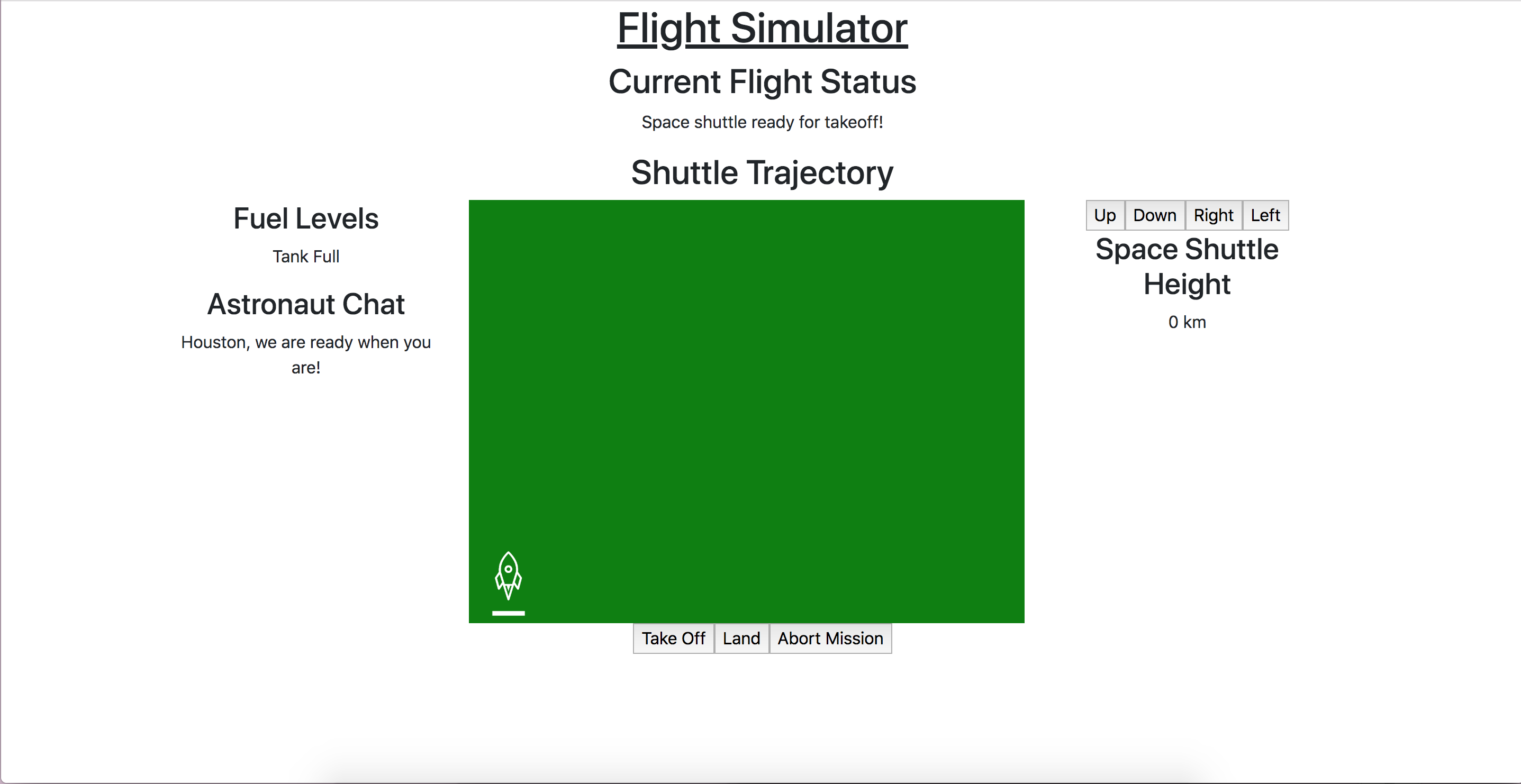
Initial view of the exercises app
The requirements are the same as before:
Open app.component.ts and take a look. The color, height, and
message properties will all be used as template variables to dynamically
update the view.
1export class AppComponent {
2   title = 'Exercises: Angular Lesson 3';
3
4   color = 'green';
5   height = 0;
6   width = 0;
7   message = 'Space shuttle ready for takeoff!';
8}
Pass in the message variable to the app html:
Add this style directive to line 19: [style.backgroundColor]="color".
Use the height property to determine the displayed height.
Refresh the page to ensure your template variables are assigned correctly.
Now, we'll add some event listeners to the three control buttons on the bottom of the page.
These listeners will reassign the values of color, height, width, and message.
Add an event listener to the Take Off button.
Back in app.component.ts, we'll define this listener. The confirm() method will look the
same as before, but this time we can use a few less lines of code to update the view.
1handleTakeOff() {
2   let result = window.confirm('Are you sure the shuttle is ready for takeoff?');
3   if (result) {
4      this.color = 'blue';
5      this.height = 10000;
6      this.width = 0;
7      this.message = 'Shuttle in flight.';
8   }
9}
Follow the same pattern to handle the Land and Abort Mission click events.
Next, we'll tackle the Up, Down, Left, and Right buttons that
move the rocket. The movement formula is the same as we've used before:
1let movement = parseInt(img.style.left) + 10 + 'px';
But now, instead of using the getElementById method, we'll
access the img element by passing it in to the click
event.
In app.component.html, label the img element so we can reference it.
While you're here, add this click handler to the Right button: (click)="moveRocket(rocketImage, 'right')"
Complete the moveRocket() method in the app's component class to handle rocket movement to the right:
Add conditional logic to this moveRocket() method to account for the other movement
directions, modifying the movement formula as needed. Be sure to also update the
height or width property where appropriate.
Along those same lines, we'll want to modify a couple of our control
button handlers to update rocketImage's position when the status
changes. Pass in rocketImage to your Land and Abort Mission
handlers and add the following:
rocketImage.style.bottom = '0px';
Right now, a user can move the rocket before it has officially taken off or abort the mission while the rocket is still on the ground. This doesn't make much sense. With attribute directives, we can dynamically set those buttons to only be enabled in some states.
In app.component.ts, let's add a check for the take off status of the shuttle.
When the app is first loaded, we want the user to be able to click the Take Off
button, but not the Land or Abort Mission button. In app.component.html, update the control buttons
to add some [disabled] attribute directives.
Based on the boolean takeOffEnabled property, only the Take Off control button is
enabled when the rocket is on the ground.
Update the control button click handlers to toggle the enabled/disabled status of the controls using this value.
For another improvement, we shouldn't be able to move the rocket if it hasn't taken off.
To toggle the status of the direction buttons, we could add more boolean checks to our
component. However, we know we only want these buttons to be accessible when the
Take Off button is not. We can therefore reuse takeOffEnabled to determine if the
user can click the direction buttons.
1<button (click)="moveRocket(rocketImage, 'up')" [disabled]="takeOffEnabled">Up</button>
In fact, since all four direction buttons share the same requirements for disablement,
we can take advantage of our old friend *ngIf to display the whole set based on
takeOffEnabled.
Lastly, let's change the shuttle's background color to a warning color if the rocket image gets too close to the edge. Add a function to your component that will check the width and height values and changes the color value to orange if those values are too high or low. Call that function in each of the direction button click handlers.