20.6. Select Inputs
A select input creates a clickable menu that gives the user a drop-down list of options. While it is possible to make the input accept more than one choice, it’s usually best to stick with allowing just one item.
The select input combines two HTML tags: <select> and <option>. The
general syntax is:
<select name="...">
   <option value="...">First menu option.</option>
   <option value="...">Second menu option.</option>
   <!-- etc. -->
</select>
When the form gets submitted, the name attribute in the <select> tag
provides the key. The value attribute from the chosen <option> is
assigned to that key.
A select input works very much like a group of radio buttons.
Example
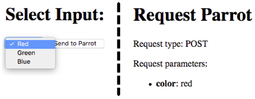
Let’s use a drop-down menu to select our color choice.
1 2 3 4 5 6 7 8 | <form action="https://handlers.education.launchcode.org/request-parrot" method="POST">
<select name="color">
<option value="red"> Red</option>
<option value="green"> Green</option>
<option value="blue"> Blue</option>
</select>
<button>Send to Parrot</button>
</form>
|

The value of the selected option element is assigned to the color key.
20.6.1. Setting a Default <option>
A select input always returns a value when a form is submitted, even if the
user never clicks on the menu. By default, select displays the first
option element as the current choice.
Just like a radio button group, we should ALWAYS offer the user a No Choice option. This can be an empty menu slot or some form of non-selectable title.
Example
Here are two examples of no choice menu options. Each one is the first
option element, and the value attribute is assigned the empty
string.
1 2 3 4 5 6 7 8 9 10 11 12 13 14 15 | <!-- Example 1: Empty Top Slot -->
<select name="color">
<option value="" selected></option>
<option value="red"> Red</option>
<option value="green"> Green</option>
<option value="blue"> Blue</option>
</select>
<!-- Example 2: Title -->
<select name="color">
<option value="" disabled selected>Choose a color:</option>
<option value="red"> Red</option>
<option value="green"> Green</option>
<option value="blue"> Blue</option>
</select>
|
Example 1 |
Example 2 |
|---|---|
The selected attribute sets an option as the default choice, and it will
be displayed when the page first loads.
In Example 1, the blank menu slot can be chosen as an option. The
disabled attribute in Example 2 (line 11) means that once the user picks
a different option, the default title cannot be re-selected.
Try It!
Return to your local index.html form.
Save and commit the work in the
radiobranch.Return to
mainand checkout a new branch calledselect.In the new branch, modify your form to use a select input with at least three options.
What happens if you submit the form without clicking the select menu?
Experiment by placing the
selectedanddisabledattributes inside different<option>tags.Try using the
hiddenattribute in place ofdisabled. What does it do to the input?
20.6.2. When to Use What
Checkboxes, radio buttons, and select drop-down menus all behave in a similar way. However, they are NOT always interchangeable. When should we use each input type?
Here are a few guidelines:
If the user needs to select multiple options, or be able to unselect items, go with checkboxes.
If the user must make a single choice from a long list, radio buttons work better than a drop-down menu.
Top-down lists are easier to read. Whenever possible, arrange a set of choices vertically instead of side-by-side.
This article also gives a nice summary of when to use the different input types.
20.6.3. Check Your Understanding
Question
For a select input, what determines the key/value pair when the form is submitted?
- The
nameandvalueattributes inside theselecttag. - The
nameandvalueattributes inside theoptiontag. - The
namefrom theselecttag and thevaluefromoption. - The
namefrom theoptiontag and thevaluefromselect.
