Build a Chart
Now that we have covered some of the basics we will create a chart with our imported data.
Note
If you have closed out the data connection to the netflix_titles.csv file, reopen the connection!
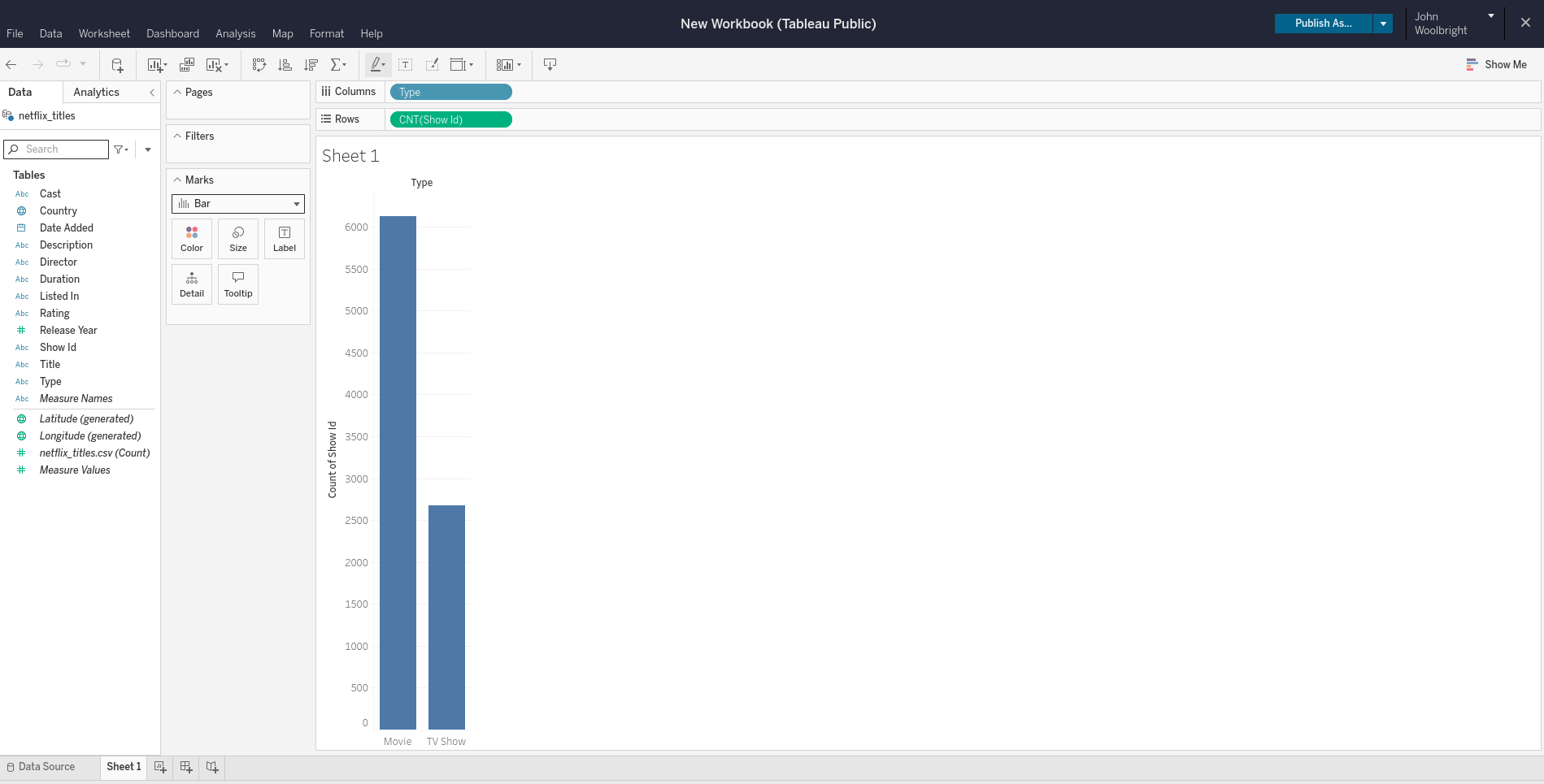
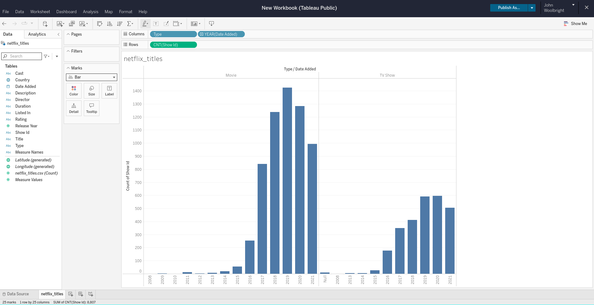
Using the netflix_titles.csv data, we will create a bar chart that shows the Type (Movie or TV Show), the Date Added (What year the Movie or TV show was added to Netflix), and the Show Id as a unique identifier to provide a CNT (count) measure. The result will be a bar chart that displays how many Movies and TV Shows were added to Netflix and in what year they were added.
Creating the Chart
- Let’s first start out by adding the
Typepill to theColumnsshelf. - Next, add the
Show Idpill to theRowsshelf.- Right-click on the
Show Idpill and change from a dimension to a measure, selecting thecountas the measure.
- Right-click on the
- Now we can add the
Date Addedpill to theColumnsshelf.
It is important to notice and understand the meaning of the green and blue pills in Tableau. As mentioned previously, the two main data types in Tableau are Measures and Dimensions.
Green pills typically represent quantitative data, which is numerical data that can be measured or counted, and hence are the Measures of your dataset(s). Examples of quantitative data include:
- Sales figures
- Customer age
- Product price
- Revenue
Blue pills represent qualitative data, which is non-numerical data that describes attributes or characteristics, and hence are the Dimensions of your dataset(s). Examples of qualitative data include:
- Product category
- Product color
- Customer location
- Order status
You will be able to perform mathematical operations, such as sum and average, on green pills (Measures), while blue pills (Dimensions) will be used for grouping / segmenting data, such as in a pie or bar chart.
Note
In the above image, we changed the sheet name to netflix_titles. You can also do this if you would like! Right-click on either the Sheet 1 name within the view or the tab in the bottom left corner to change the name.

