Exercises: Tableau Part 1
Getting Started
We will continue working with the Netflix Movies and TV Shows dataset from Kaggle. The goal of these exercises will be to create a basic dashboard and expand on some of the columns of data within the Netflix dataset.
If needed, create a connection to the netflix_titles.csv file.
Note
As you work on each of your sheets, think about a descriptive name that you would want to apply to them. This will help when you add them to your dashboard to better understand what each sheet is meant to visualize.
Sheet 1: Total of Movies vs TV Shows
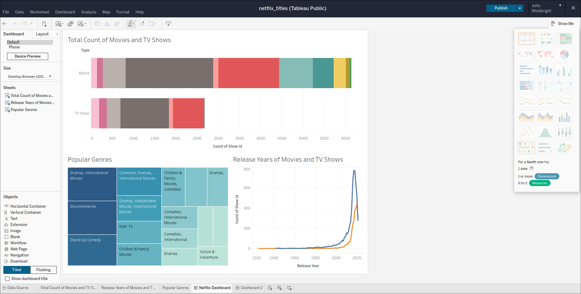
The first worksheet will contain a a total count of Movies and TV Shows. We will display this information in a horizontal bar chart.
- Drag and drop the
Show Idpill into theColumnsshelf.- Convert it to a measure of
Count
- Convert it to a measure of
- Add the
Typepill to theRowsshelf. - Add the
Ratingpill as aColorwithin theMarkscard to provide some additional detail on the Movies and TV Shows. - Finally, in the Marks section, click the dropdown and select the
Baroption to ensure our Viz presents the data as a bar chart. - Right click the Sheet tab and use the Rename option to rename the sheet to this:
Total Count of Movies and TV Shows
This provides a visual of how many Movies vs TV Shows there are within the given years, and how many Movies and TV shows exist within all available ratings.
Sheet 2: Release Year and Type
The second worksheet will contain a line graph displaying how many Movies and TV shows were released in the available years.
- Drag and drop the
Release Yearpill into theColumnsshelf. - Add the
Show Idpill into the rows shelf and convert it to a measure ofCount. - Add the
Typepill as aColorwithin theMarkscard to display both Movies and TV Shows, and when how many of each were released per year. - For this viz, we can stick with the
Automaticviz option in the Marks section. This should render our data as a multi-line chart. - Right click the Sheet tab and use the Rename option to rename the sheet to this:
Release Years of Movies and TV Shows
Sheet 3: Popular Genres
The third and final worksheet that you will create for your dashboard is going to display popular genres among the Movies and TV Shows.
- Drag and drop the
Show Idpill into the Marks card as aColorand convert it to a measure ofCount. - Add another
Show Idpill into the Marks card as aSizeand convert it to a measure ofCount. - Add the
Listed Inpill into the Marks card as aLabel.
This is a bit too granular for a dashboard as there are many boxes that do not display a label for the associated genre. Let’s apply some minor conditional filtering to the Listed In pill.
Right click on the
Listed Inpill- Click on filter
- Click on the Condition section
- Click By Field
- For the
Field, selectListed In. For theAggregation, selectCount - Under the Comparison section select the
>=option and add128as the Value.
Right click the Sheet tab and use the Rename option to rename the sheet to this:
Popular GenresNote
You will learn more about filtering in the next Tableau lesson, but this serves a brief introduction!
Create a Dashboard
We are introducing dashboards to you now so that you can easily publish your work.
But, you should know that there are best practices for dashboards that we will cover in a later chapter.
Click on the Dashboard tab at the top of your workbook and click New Dashboard or click on the New Dashboard button on the bottom of your workspace.
- From inside the
Dashboardview pane on the left side of the window, under theSheetssection, drag and drop your existingSheetsinto the dashboard view.
Note
Feel free to customize this any way you like!
End Result
If you didn’t make any customizations after these steps, your dashboard should look similar to the following image:
Submitting Your Work
When finished make sure to save and publish your work to your Tableau Public account. Copy the URL to your published Tableau project and paste it into the submission box in Canvas for Exercises: Visualization with Tableau Part 1 and click Submit.