Filtering and Sorting
Previously, we talked about keeping it simple in Chapter 22 when we introduced data visualization best practices. Because we are using Tableau to put together our dashboards and stories as part of presenting our findings, we want to make sure that we are following best practices and only displaying the data we really need to.
This is where data preparation comes in. Tableau has a number of features that we will explore throughout this chapter to keep our visualizations clean and simple.
Throughout the previous chapters on cleaning data, we talked about removing unnecessary data. But what if we don’t want to delete the data, just exclude it from our reporting?
Filtering data is for when we want to keep the data, but there is too much data on the visualization. Tableau gives us a number of different ways we can filter our data. But, in order for our filters to work, we have to pay attention to the type of filter we are using and the order in which Tableau will apply these filters.
Tableau’s Order of Operations
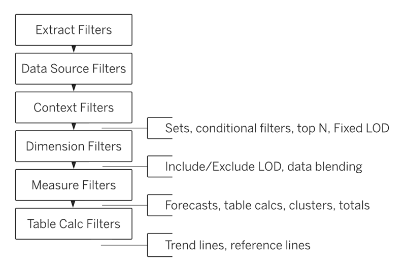
Tableau follows an order of operations, also known as the query pipeline. The query pipeline dictates the order in which filters are applied and if you do not follow these rules, your filters may not work as expected!
Here is the order in which different Tableau filters are run:
- Extract filters
- Data source filters
- Context filters
- Dimension filters
- Measure filters
- Table calculation filters
Within each of the categories in the query pipeline, there are subcategories. The diagram below shows the query pipeline order with these subcategories included. It may be beneficial to save this diagram so you have it on hand for the next few chapters.

 Image courtesy of Tableau
Let’s review what each of these categories mean.
An extract is a saved snapshot of your data in Tableau’s own format. An extract filter is a filter applied when creating this extract, determining which data gets included in the snapshot.
If you work for an online retailer that specializes in jewelry and want to analyze earring sales for the past 6 months, you may start by pulling the data into Tableau from a SQL Server. However, if you already know that you only need the data from the past 6 months, you may apply an extract filter to ensure that only the data from the past 6 months is included in your extract. This reduces the file size and improves performance.
Once you load the data into Tableau, the data is known as the data source. A data source filter is a filter applied to the data source before a visualization needs to be made.
You will find it very helpful when visualizing data to first review your data source and think hard about what you do and do not need. In the case of earring sales, you might realize that the actual dimensions of the sales are not as important as the category, so you can apply a data source filter before you begin working on your visualizations.
A context filter and a dimension filter both do similar things, so this is where the order of operations becomes vital!
The context filter comes first in the order of operations and creates a temporary filtered dataset. All subsequent filters (including dimension filters) then operate on this filtered context rather than the full dataset.
A dimension filter operates after context filters in the query pipeline and filters the data independently.
You may find a context filter handy when working with large datasets because it reduces the amount of data that subsequent filters need to process, which can improve performance.
If we only have a few thousand earring sales to visualize, you may not notice a difference. But, a few million sales records could bog Tableau down.
Both filters remove whole columns or rows from the dataset. As we dive into the visualizations, we might find it unhelpful to have a dimension for item name because some of the names are long and do not look nice when we assemble our visualizations.
This would be a perfect use case for a dimension filter because upon assembling the visualizations we have discovered that we do not need that whole column. You may not see context filters as often as dimension filters.
Measure filters remove specific cells that don’t match a given condition. In the case of analyzing earring sales, you may want to perform some visualizations based on the price of the earrings sold. You can use a measure filter to only visualize earrings that are priced between $50 and $100.
Finally, we have table calculation filters. We will be covering table calculations in a later chapter, so for now, you just need to know that table calculations allow you to convert values in a table to suit your needs.
Note
You may not need all of these filter types immediately. But, we want to drive home the order of operations now so you don’t get tripped up later.
Adding Filters to Tableau
You can apply filters in a few different ways in Tableau.
- Selecting data points in an existing visualization.
- Add a filter through the Actions menu.
- Drag dimensions and filters to the Filter shelf.
For now, we are going to focus on the final method which is how we can add dimension and measure filters within Tableau. As you become more experienced with Tableau, you may find one of the other methods works better for you. We encourage you to keep exploring the platform beyond what we cover in this class!
The Filter Shelf
In the previous chapter, you created your first dashboard and spent some time familiarizing yourself with the Data pane. Right next to the Data pane, we have the Filter shelf. To create a filter, you can drag a measure or dimension to the Filter shelf and answer the questions in the dialog box.
Dimension Filter
Dimensions contain qualitative data. When you drag a dimension to the filter shelf, a dialog box should appear with four tabs: General, Condition, Wildcard, and Top.
The General tab gives us categories of data that we can check or uncheck to include or exclude the data. An example of how we might use the General tab to filter earring sales would be to pull over an Item Category dimension and opt to exclude “hoops”.
The Wildcard tab allows us to establish a pattern that the qualitative data has to match for filtering, such as the item name having to include “Fall 2024”.
The Condition tab allows us to designate a specific condition for one of the dimensions for filtering, such as only allowing items that are a specific size.
The Top tab works similar to the way SELECT TOP worked in SQL. We can designate that we only want the top 30 items in a price category dimension.
Note
Not all versions of Tableau have a Wildcard tab. Tableau Desktop is the main one that does.
Measure Filter
Measures contain quantitative data. When you drag a measure to the filter shelf, you can select how you want to aggregate your data, such as sums or counts, and then you can choose which one of the four types of quantitative filters you would like to use: Range of Values, At Least, At Most, and Special.
Range of Values specifies what range the value of your measure should fall in, whereas At Least and At Most specify the bottom and top of the range, respectively.
Special allows users to specify filtering on such values as Null. We could use all of these filters to filter out data points in a Units Sold measure.
Sorting Data
In addition to filtering data, sorting data can help make visualizations easier to read for your viewers. Sometimes you can just hover over the axis and click on the Sort icon to change how the visualization is sorted.
You can also sort your dimensions from the toolbar by selecting the field you want to sort and then clicking the appropriate Sort icon, whether you want to sort the items in ascending or descending order.
Check Your Understanding
Question
Which filter is the first in Tableau’s order of operations:
- Context filters
- Data source filters
- Extract filters
- Measures
- Dimensions
Question
Willow wants to filter some qualitative data in a chart she is making about pets. Which of following is an example of qualitative data:
- A list of common pet names
- A map of geographic points within Australia
- A time field spanning over 5 years
- Average number of animals
Question
Willow wants to only show data about dogs.
Her data set contains a column Type of Pet that contains these string values: “dog”, “cat”, “rodent”, “bird”, “reptile”, “amphibian”, “rabbit”, and “other”.
Which of the following filter features would allow her to only show data about dogs?
- Wildcard
- Top
- Conditional
- General