Spreadsheet Mastery: Exercises Part 2
The Order Summary Report that you submitted last week was well received by your department director and the key stakeholders in external departments.
The stakeholders have requested a set of interactive PivotTables in addition to the static report, so you schedule a meeting with your department director and the interested parties to gather requirements for the build.
Requirements
- In Microsoft Excel
- Focuses on Shipping Status categories
- One workbook with multiple worksheets, including:
- Summary Report for Total Reporting Period (as currently exists)
- PivotTables by previously defined categories
- All KPI calculations included
- Category slicers
- Date timeline selector
- Related Charts and Graphs
The specifications are simple. The stakeholders know the information they want to access and how they would like to interact with the data, but they are not particular about the overall design. This leaves the design and build almost entirely to your professional opinion.
You decide to create a mockup of several PivotTable options to review with your department director before you finalize the components that will be included in the final deliverable.
Your Plan
Use the template file that you kept from last week’s Order Summary Report, add a new worksheet and name it Mockup. Be sure to build all components in this worksheet to keep your template workbook organized. Number formats and field header naming conventions should align with the Summary Report when possible.
Create the following PivotTables:
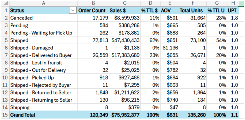
Order Count,Sales $,% TTL Orders,% TTL Sales $,AOV,Total Units,% TTL Units, andUPT by Status. Status in rows and values in columns. It should look like this:Create the same PivotTable with both the status and the values in the rows. Drag values before status and status before values. Decide which view you like best and keep this component. Note to Self: Copy/Paste previous PivotTable and edit pasted copy where applicable to save time.
Create the same PivotTable with the values in the rows and the status in the columns.
Order Count by Status. Status in rows and values in columns.Sales $ by Status. Status in rows and values in columns.Unit Count by Status. Status in rows and values in columns.AOV by Date. Date in rows and values in columns.UPT by Status. Status in rows and values in columns.% Total Orders,% Total Sales $, and% Total Unitsfor each status. Status in rows and values in columns.Create another PivotTable identical to Step 1 but replace
StatuswithFulfillment_Status.Create another identical PivotTable and add
ship-service-levelas the first category, appearing beforeFulfillment_Statusin the rows. Reorder the categories. Decide which view you like best and keep this component.Create another PivotTable that displays
Order Count by Sales Channeland then byStatus. Categories in rows and values in columns.Create another PivotTable that displays
Sales $and the numerical rank of theSalesvolume byStatus. Category in rows and values in columns. Sort this table byRank, largest to smallest.To conceptualize different style options that you might consider for your final dashboard solution, apply different formatting options to each PivotTable using the PivotTable Styles and PivotTable Options menus.
As you continue to develop and format components, you realize that you want to use one worksheet per component to make additional room to add Slicers, Timelines, and Charts. Use the Move PivotTable action from the ribbon to move your components to new worksheets, renaming the worksheets to numbers that align with these Step numbers (1,2,3, etc.).
Add Category Slicers and Timeline Selectors to each PivotTable. Adjust slicer connections to control only the PivotTable on the related worksheet. Use the formatting menus for the slicers and timelines to design each one differently, aligning these controls with the aesthetic of the PivotTable. Notice how your PivotTables update when different slicer and timeline options are selected.
Create PivotCharts for the following PivotTables. Spend time updating the formatting options to best display your visualization, Axis Title, Axis Labels, data labels, etc. Charts should be visually appealing and easy to read. Remember that these charts will update dynamically based on the slicer and timeline selections, so be sure to test the appearance of each before you finalize.
- 2-D Pie Chart for PivotTable 4 displaying the
Order Count per Category. Sort byOrders, largest to smallest, and update slicer to only display the top 5 categories. - Column Chart for PivotTable 5 displaying the
Sales $ per Category. Sort bySales $from largest to smallest. - Line Chart for PivotTable 7 displaying the
AOVover time. Add a trend line.
- 2-D Pie Chart for PivotTable 4 displaying the
Your department director asked that you provide a status update as you build out different component and style options, so you decide to stop here to send the workbook for review.
Upload the Microsoft Excel Workbook to Canvas under Class 5 Exercises: Order Summary Pivots and click Submit.
